
Anatomy of a Book Cover

Picture this: you are browsing around the bookstore, library, Amazon (wherever it is you find your books…) and instantly you stop in your tracks. You have found the most beautiful cover you have ever seen. You pick it up, examine the front. Flip it over to read the blurb, and if you REALLY like it that much, you might shuffle through some of the interior pages.
Has this ever happened to you? It probably happens every time I walk into Barnes & Nobel. But what is it about a cover that makes a stop and do a double take? Essentially it’s just some kind of picture with words or even just words and no image at all.
What goes into a cover? What are the elements?
Well, let’s break it down.
Title
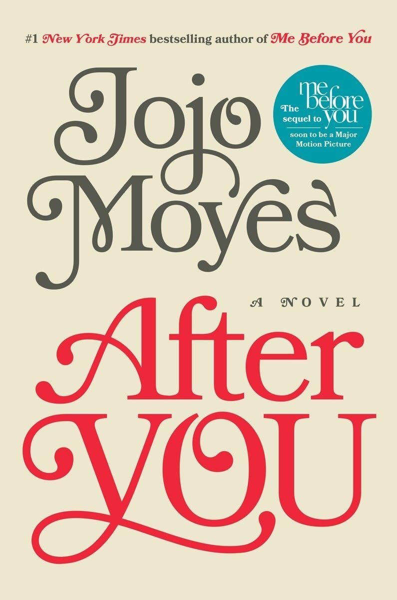
Every book has a title. Sometimes the title tells you exactly what’s going on and sometimes it’s a little more elusive. A title can really make or break a book. It needs to be intriguing, eye catching and clear but not give away the story. In Jojo Moyes’ book, After You, the title is the design. It serves two purposes, telling the reader the name of the book and creating a visually interesting design, creating a clean and contemporary feel.
If you are publishing a book, a good practice would be to write out your title over and over. Think about how it will look on the front. Certain letters look better than other, sometimes a long title works and sometimes your book needs a short one. It’s important to remember it visually needs to work as well.
Author
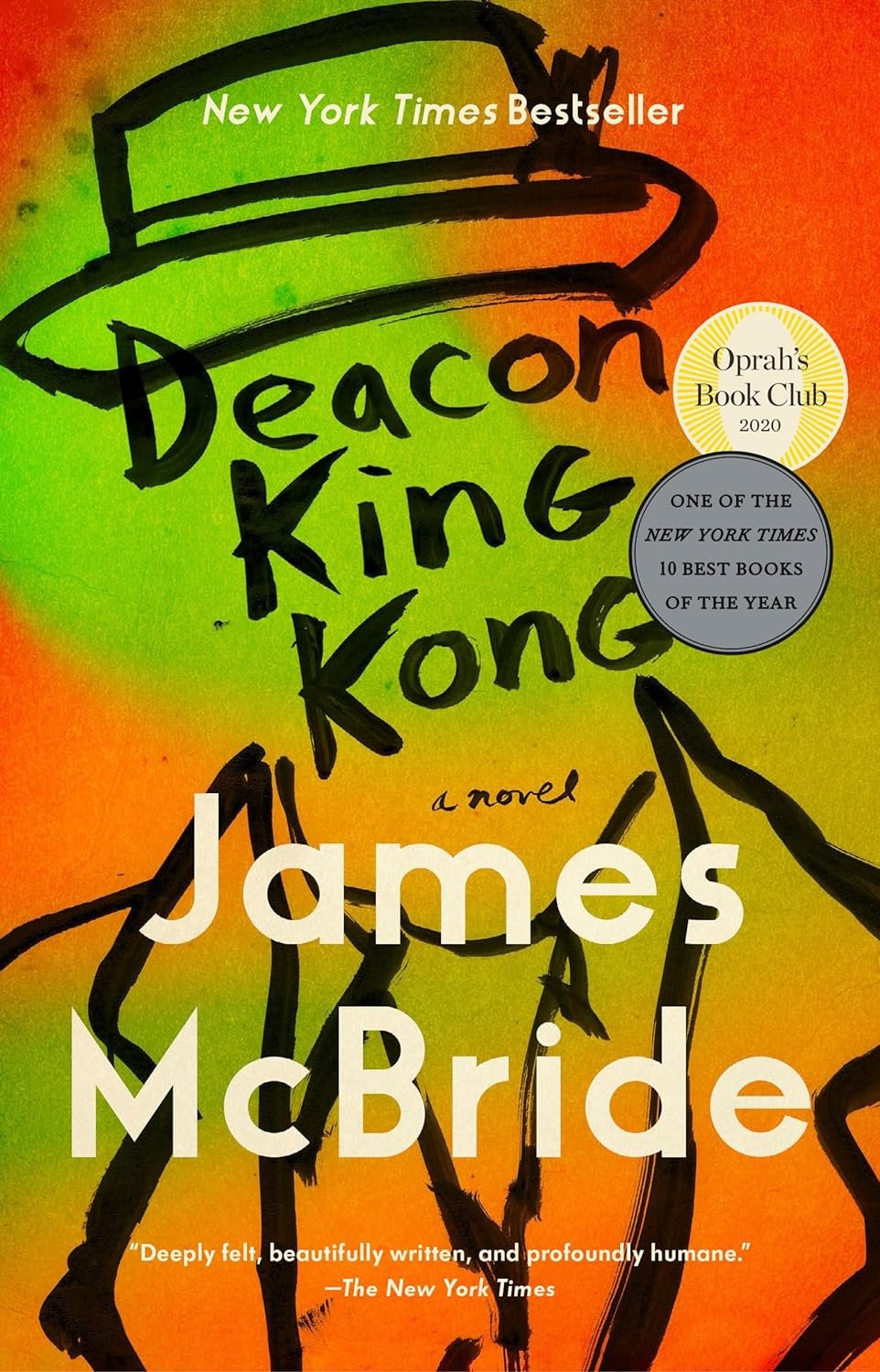
Just as important as the title and or sometimes even more (authors with a large fanbase profit from their name being prominent). I love how the title is incorporated into the overall design for Deacon King Kong which gives the author’s name a little more room to shine. The two items take up a good chunk of real estate on the front but aren’t competing since once is incorporated into the overall look.
Main Design & Design Elements
The overall design varies depending on the message you want to send the reader. As in the above covers, there is a combo of illustration and typography. Some books are all image, more like Christopher Hawkins where others are all type. A lot of handlettering artists are employed to blend the two together, where type then becomes the image. Letters are essential a bunch of shapes but together in a specific order, so the design possibilities are endless.
Labels and Endorsements
Now go back to the bookstore we talked about earlier…You just picked up a book, you like the design and then you see that one of your favorite authors wrote a little review, right there on the cover. You feel a little more of a nudge to keep that book in your hand and walk up to the register. And what about those Oprah’s Book Club and Rees’ Book Club stickers? Do you find yourself gravitating to the books with these little endorsement details? I know I do. If I’m going to invest in a book, I want to know there is a high probability my money won’t be wasted. These small details help legitimize the book and make a reader more comfortable in the purchase.
There is so much more to the cover of a book I haven’t even gotten too (the spine and back matter too!) but we will save that for another post. Until next time! :)
**If you’re a self-publishing author looking to get a cover made, drop us a line here.